Build an Autosizing Textarea With Vue
So you’ve seen those cool textarea components in frameworks like Vuetify and VueMaterial, but you don’t want to install a full UI framework for your new project. That kind of effect is actually pretty easy to set up once you know a couple tricks. So let’s jump right in…
Project Setup
Make sure you have vue-cli installed before initializing the project:
npm install -g vue-cli # if not already installed
vue init webpack-simple vue-autosize-textarea

? Project name vue-autosize-textarea
? Project description A Vue.js project
? Author Your Name <your.email@domain.com>
? License MIT
? Use sass? Yes

cd vue-autosize-textarea
npm install
First of all, let’s clear our work area by gutting src/App.vue. You can just replace the file contents with the following:
<!-- src/App.vue -->
<template>
  <div id="app"></div>
</template>

<script>
  export default {
    name: 'app'
  }
</script>

<style lang="scss">
  * {
    box-sizing: border-box;
  }
</style>
I like to put box-sizing: border-box; on everything to make heights and widths easier to work with. While it’s not strictly necessary to put that on everything, the textarea component will need it to function properly without doing additional calculations for padding.
We’re only building a single component today, so let’s make sure we build it in a reusable way. Create a new file at src/components/AutoTextarea.vue. Populate that file with the basic component markup. We’ll flesh this out shortly.
<!-- src/components/AutoTextarea.vue -->
<template>
  <div class="textarea">
    <textarea></textarea>
  </div>
</template>

<script>
  export default {
    name: 'AutoTextarea'
  }
</script>

<style scoped lang="scss">
  .textarea {
    textarea {
      padding: 8px;
      border: 1px solid #aeaeae;
      resize: none;
      overflow: hidden;
      font-size: 16px;
    }
  }
</style>
Just a couple things worth noting here.
We’ll ultimately need a wrapper element for the effect, so it will be less rework to just do that now.
Additionally, we have the scoped attribute on the styles. If you prefer to reuse input styling it would probably make sense to pull that out into a more centralized compiled stylesheet. This is beyond the scope of this article.
The last thing we need to do before getting into the meat of this component is pull it into App.vue.
<!-- src/App.vue -->
<template>
  <div id="app">
    <auto-textarea v-model="inputValue"></auto-textarea>
  </div>
</template>

<script>
  import AutoTextarea from './components/AutoTextarea.vue'

  export default {
    name: 'app',
    components: { AutoTextarea },
    data () {
      return {
        inputValue: ''
      }
    }
  }
</script>

<style lang="scss">
  * {
    box-sizing: border-box;
  }
</style>
In addition to pulling the textarea into the main app file, we’re passing a value to the input via v-model. Our component isn’t set up to do anything with that yet, but we can set that up pretty easily. So let’s take care of that as our first step in fleshing out the component.
Two-Way Data Binding
Head back over to AutoTextarea.vue and let’s take care of that.
The basic idea is pretty straightforward. We pull in content from the v-model declared in the parent as a prop, and assign that value to the component’s data object. That data object attribute is then assigned to the textarea’s v-model property. Each time that value gets updated we $emit an input event to the parent to let it know the value has been updated.
Here is what the code looks like:
<!-- src/components/AutoTextarea.vue -->
<template>
  <div class="textarea">
    <textarea v-model="currentValue"></textarea>
  </div>
</template>

<script>
  export default {
    name: 'AutoTextarea',
    props: {
      value: String
    },
    data () {
      return {
        currentValue: ''
      }
    },
    watch: {
      currentValue () {
        this.$emit('input', this.currentValue)
      }
    }
  }
</script>

<style scoped lang="scss">
  ...
</style>
You can check in the browser that this is working by looking at the component’s data in Vue Devtools. If you don’t already have this installed I highly recommend it. There is no better way to see what’s happening in your application than viewing its state through this tool.
Auto-Resize the Textarea
Finally we’ve arrived at the real meat of this component, automatically resizing the textarea based on the amount of content inside it. This, as it turns out, is also pretty straightforward… with a small caveat.
We can start by zeroing out the height via CSS. We’ll be resizing the textarea based on it’s scrollHeight, so starting with nothing is as good a baseline as any.
<!-- src/components/AutoTextarea.vue -->
<style scoped lang="scss">
  .textarea {
    textarea {
      ...
      height: 0;
    }
  }
</style>
The next step is to take care of the actual resizing. The basic idea here is to use the scroll height to set the height of the textarea. That way when a user types enough to reach a new line the scrollHeight will increase, and we can automatically increase the height of the textarea.
We’ll need to add a few things to the component to make this happen. First, we need a new piece of data on the component to store the current height of the textarea. Then we need to tie that height to a style binding to give the textarea a minimum height. Finally, we need a resize method to set the height to the scroll height. We’ll need to call the resize method from the mounted lifecycle method on the component, as well as every time currentValue updates.
<!-- src/components/AutoTextarea.vue -->
<template>
  <div class="textarea">
    <textarea v-model="currentValue" ref="input" :style="inputStyle"></textarea>
  </div>
</template>

<script>
  export default {
    name: 'AutoTextarea',
    props: {
      value: String
    },
    data () {
      return {
        currentValue: '',
        inputHeight: '0'
      }
    },
    watch: {
      currentValue () {
        this.resize()
        this.$emit('input', this.currentValue)
      }
    },
    computed: {
      inputStyle () {
        return {
          'min-height': this.inputHeight
        }
      }
    },
    mounted () {
      this.resize()
    },
    methods: {
      resize () {
        this.inputHeight = `${this.$refs.input.scrollHeight}px`
      }
    }
  }
</script>

<style scoped lang="scss">
  ...
</style>
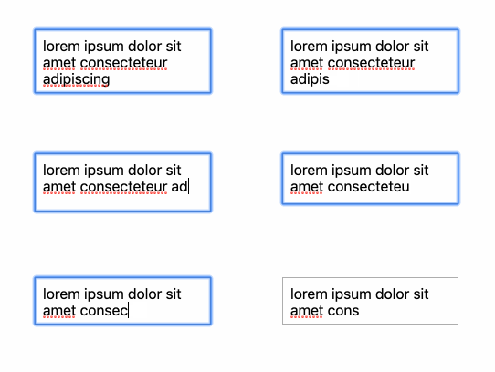
This works, but not perfectly. The textarea resizes up perfectly, but when going down a line the resize becomes staggered.

Depending on the rest of your project, your textarea might not resize down at all. This is because the scroll area is already larger than the height, so resizing down doesn’t work quite as well.
There is one last trick we can pull to fix this behavior.
Shadow Textarea
The basic idea is to add a second textarea with the same styling and a height that never changes. Once that is in place, we can set the visible textarea’s height from the shadow textarea’s scroll height. Since the shadow textarea never gets any larger, its scroll height will snap the visible textarea scroll height down when a line is removed.
<template>
  <div class="textarea">
    <textarea v-model="currentValue" :style="inputStyle"></textarea>
    <textarea class="shadow" v-model="currentValue" ref="shadow" tabindex="0"></textarea>
  </div>
</template>

<script>
  export default {
    name: 'AutoTextarea',
    props: {
      value: String
    },
    data () {
      return {
        currentValue: '',
        inputHeight: '0'
      }
    },
    watch: {
      currentValue () {
        this.resize()
        this.$emit('input', this.currentValue)
      }
    },
    computed: {
      inputStyle () {
        return {
          'min-height': this.inputHeight
        }
      }
    },
    mounted () {
      this.resize()
    },
    methods: {
      resize () {
        this.inputHeight = `${this.$refs.shadow.scrollHeight}px`
      }
    }
  }
</script>

<style scoped lang="scss">
  .textarea {
    textarea {
      padding: 8px;
      border: 1px solid #aeaeae;
      resize: none;
      overflow: hidden;
      font-size: 16px;
      height: 0;

      &.shadow {
        max-height: 0;
        pointer-events: none;
        opacity: 0;
        margin: 0;
      }
    }
  }
</style>
This is a pretty simple change. We add the shadow input, along with some styles and attributes that will hide it from the browser as well as possible without hiding it from the DOM. Then we change our resize method to pull scrollHeight from the shadow textarea instead of the visible textarea.

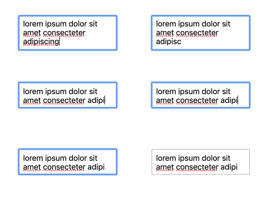
And our auto-resize is working!
At this point you can add additional styling, or put a transition on min-height to make the change smoother. If you’re not using box-sizing: border-box; you’ll need to adjust the resize calculation to account for vertical padding.
Enjoy! And let me know of any ways I can make this article better down below!
View the code on Github.